Following low-key logo updates from Google and Walmart, we’ve rounded up five recent rebrands that were barely noticeable.
Subtle makeovers have proven popular in recent years – barring the controversial Jaguar rebrand – with companies weary of rocking the boat in the face of a tumultuous economy and potential online criticism.
See if you can spot the nearly imperceptible changes in these five examples.

G by Google
This week saw Google quietly roll out a logo update on its iOS and Android app, rendering its G icon in gradient instead of block colours.
It marks the first time the circular symbol has been updated since it replaced Google’s all-blue lowercase g nearly a decade ago.
Find out more about Google’s updated G logo ›

Walmart by JKR
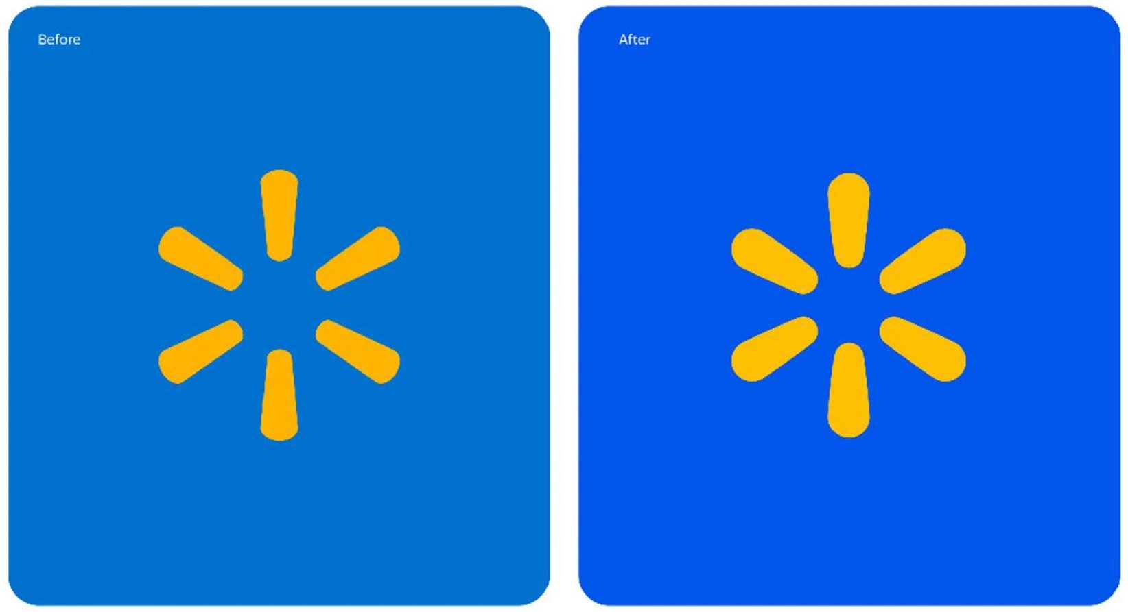
Branding agency JKR created a slightly bolder version of Walmart’s logo at the start of 2025 by blowing up the wordmark and its yellow “spark” icon.
The rebrand also introduced more vibrant colours, while rounding off the edges of the characters for a more digital-feeling brand identity.
Find out more about the updated Walmart logo ›

Amazon by Koto and Amazon XCM
It took 18 months for design agency Koto to deliver this update on the Amazon logo.
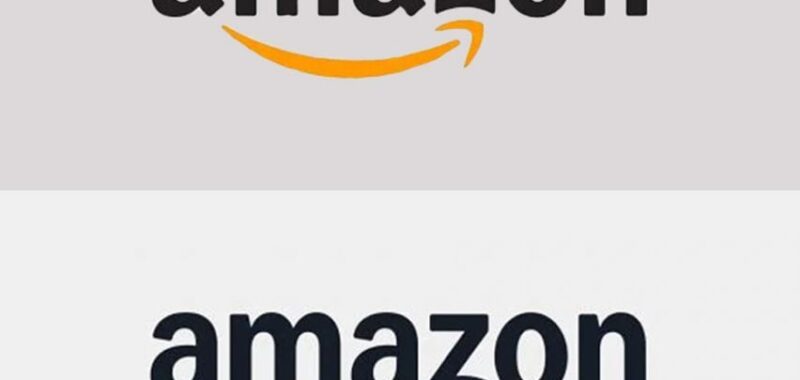
Unveiled earlier this month, the logo features a “more empathetic” smile with an expanded shaft and point, rendered in a saturated, custom tangerine orange dubbed Smile Orange.
“Developing and implementing this new identity system was an enormous undertaking,” said the studio.
Find out more about the updated Amazon logo ›

IKEA redesign by Seventy Agency
IKEA’s first logo redesign since 1983 saw Stockholm brand agency Seventy Agency subtly enlarge the blue block letters of the wordmark to fill its surrounding yellow oval.
The studio also moved the trademark symbol inside the oval and introduced a more muted blue for easier reproduction both on- and offline.
“We wanted to maintain the unique characteristics of the original iconic design, but make subtle, yet impactful changes to the logo for a better experience across all formats,” Seventy Agency explained.
Find out more about the IKEA rebrand ›

Herman Miller by Order
The swooping M symbol of furniture brand Herman Miller was freed from the confines of its red circle in this rebrand by Order.
The New York design studio also reverted back to a Helvetica-style typeface, nodding to the modernist branding of its previous logo from 1968.
Find out more about the updated Herman Miller logo ›
The post Can you spot the difference in these five subtle rebrands? appeared first on Dezeen.

